-
Types of data
-
Quantitative variables – how much
-
Continuous variables – business profits, sales, etc
-
Discrete – counting things
-
Categorical variables – what type
-
Unordered – also called nominal
-
Ordered – also called ordinal
-
Grades – A, B, C, D, and F
-
Class level – 1 st, 2 nd, 3 rd, and 4 th
-
Responses on a survey
-
Possible to convert one variable into another
-
Stem and Leaf Plots
-
Data should be plotted to get an idea what it looks like
-
This method is old
-
Example: Company’s assets in $ billions
-
Data – 3.5, 6.9, 4.4, 4.4, 2.2, 5.3, 4.3, 4.0, 5.1, 7.1, 0.6, 5.3, 6.7
-
Scan data and find the smallest and largest numbers
-
The data is unordered
| 0 |
6 |
| 1 |
|
| 2 |
2 |
| 3 |
5 |
| 4 |
4 4 3 0 |
| 5 |
3 1 3 |
| 6 |
9 7 |
| 7 |
1 |
-
The data is ordered
| 0 |
6 Possibly an outlier |
| 1 |
|
| 2 |
2 |
| 3 |
5 |
| 4 |
0 3 4 4 |
| 5 |
1 3 3 |
| 6 |
7 9 |
| 7 |
1 |
-
Outlier – an extreme value
-
Benefit? – The only plot where we still have the original data
-
Median – a mid point of a data set
-
Take data and order it from smallest to largest
-
Example
-
Unordered: 4.5 6.3 6.1 5.5 7
-
Ordered: 4.5 5.5 6.1 6.3 7
-
The median is the value in the center, which is 6.1 in our case
-
The median is not sensitive to outliers
-
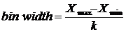
If the data has an even number of points, then take the average of the two points in the center
-
Example
-
Unordered: 3 10 8 7
-
Ordered: 3 7 8 10
-
The median is the average of 7 and 8, which is 7.5
-
The average is (7 + 8)/2 = 7.5
-
Measures of variance
-
Range – the difference between the largest value in the sample (the maximum) and the smallest value (the minimum),

-
-
Very sensitive to outliers
-
Example
-
Unordered: 5 4 6 7 100
-
Ordered: 4 5 6 7 100
-
The range is [4, 100]
-
Did you notice the 100? It appears to be an outlier, because it is very large relative to the other numbers
-
Quartiles – divide the data into four groups
| 0 to 25% |
Bottom 25% of values |
| 25 to 50% |
|
| |
Median is 50% |
| 50 to 75% |
|
| 75 to 100% |
Top 25% of values |
-
-
Usually works well for large data sets
-
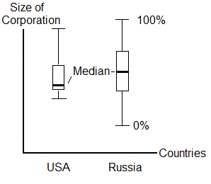
Box-Whisker Plots – a nice way to plot quartiles
-
Excel cannot do this!
-
We can have several Box-Whisker Plots side by side
-
-
Some statistical programs can calculate these
-
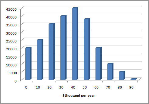
Histograms – for continuous variables
-
Excel can do this with some difficulty
-
Steps
-
Take the data and categorize into groups; groups are ranked
-
Count how many are in a group, which is the frequency
-
A histogram displays the distribution of data
-
Excel
-
Find the maximum data point by using =max( ) function
-
Find the minimum data point by using = min( ) function
-
Specify the number of categories, k, which are also called bins
First category: min. to min. + (width)(1)
Second category: min. + (width)(1) to min. + (width)(2)
Last category: min. + (width)(k – 1) to min. + (width)(k)
-
Then use =countif( ) function to count how many data points fall with a category
-
This part is hard
-
Excel has a histrogram function in Data Analysis
-
If you choose too many categories, then you get noise
-
Bar charts – categorical data
-
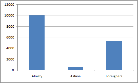
Example – Medeo collects information on visitors for 2008
-
Almaty has 10,031 visitors
-
Astana has 542
-
Foreigners who visited are 5,321
-
Could convert frequency into a percentage
|